The challenge
As schools become less dependent on local authorities, The Key – a national information service for school leaders – has become an increasingly important source of knowledge and ideas for education professionals. It provides instant answers to their questions on every aspect of managing a school.
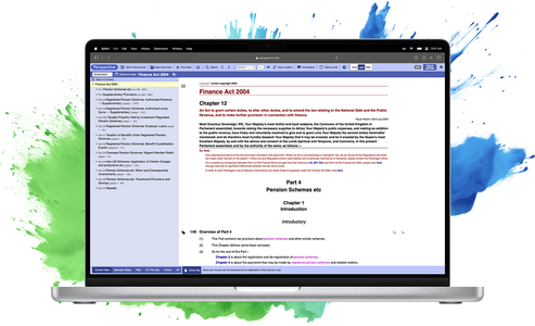
We were there for its launch in 2007 and we were proud to have helped it evolve over the years. But by 2016, we knew this was a transformation whose time had come. The Key needed to present new types of information in new ways. The answer was a better content management system that recognised how people were actually using it. In this case, that meant moving from Plone to Wagtail.
How could we make The Key more intuitive while preserving its essence?
The proposition
We’re not fans of change for change’s sake. We prefer the principle of only reworking something if it solves a problem or is a clear improvement. Of course, users don’t really like change either.
With so many users accessing so much content over such a long time, we’d learned a lot about what The Key’s customers want to know. We’d built a vivid picture of how they prefer to use the site.
As mobile devices gained ground on desktops and laptops, we saw that people were increasingly visiting The Key on their phone or tablet, out of school hours, and often at the weekend (7pm on Sunday was a particular favourite). This gave us clear direction on how to make the site more engaging and easier to navigate.
The project journey
We had to keep The Key’s existing character, while making it more satisfying to use. This involved transferring more than 30,000 pages across two websites, complete with full page history, making sure we preserved all of their content and metadata.
Having gone into schools, talked to users and watched how they behaved, we also made changes we knew they would appreciate. For example, we removed a left-hand navigation column that was useful in theory but ignored in practice. We made sure that ‘See also’ links appeared at the beginning and end of an article, to make it easier for people to pursue a particular theme.
We made the homepage more like a magazine cover, promoting eye-catching news and topical content. And we added a mini homepage below each article to entice people to explore further.
The impact
The Key now supports more than three quarters of the schools in England. Registered users include over 100,000 school leaders and 17,000 governors, who have access to 5,000 original articles and resources every month.
Case study
A more accessible knowledge base for Skills Builder
Skills Builder, deeply rooted in education's essence, perceived the gaps in the existing digital learning environments. The mission was clear: create a more intuitive, responsive, and immersive platform. By bridging technology and pedagogy, the newly-imagined Skills Builder platform offers educators and learners a revamped digital experience, tailored to the modern age's demands.
Get in touch
We craft trailored solutions for unique challenges, not off-the-shelf or one-size-fits-all. We thrive on finding beautiful answers to complex challenges, using our experience and expertise to create results you can rely on.
The Isotoma way
Teamwork is at the heart of everything we do - trusting our people has always been one of our key values. With mixed-function development teams, we run our projects along agile lines.
You may also be interested in...


